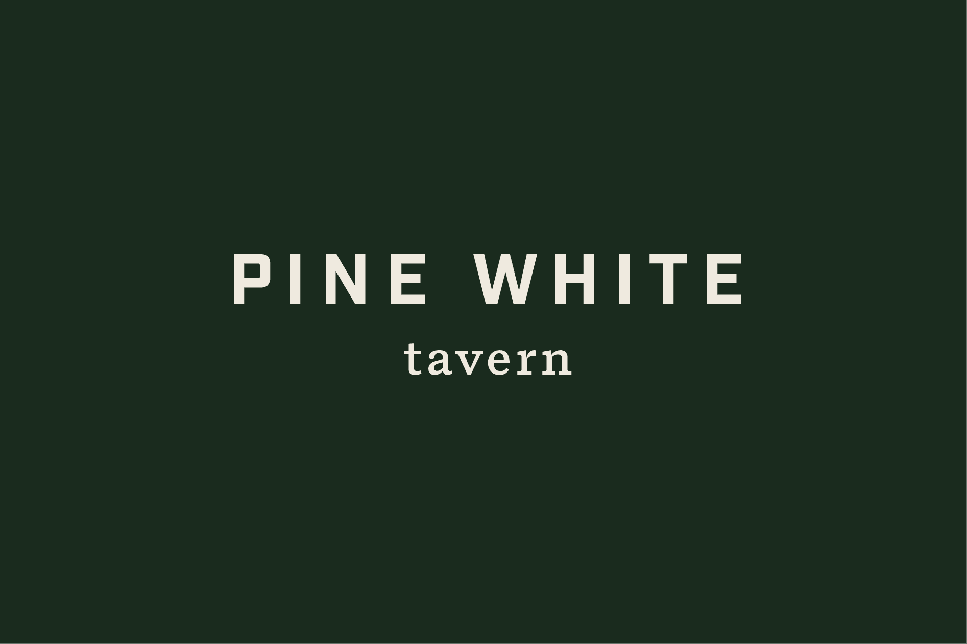
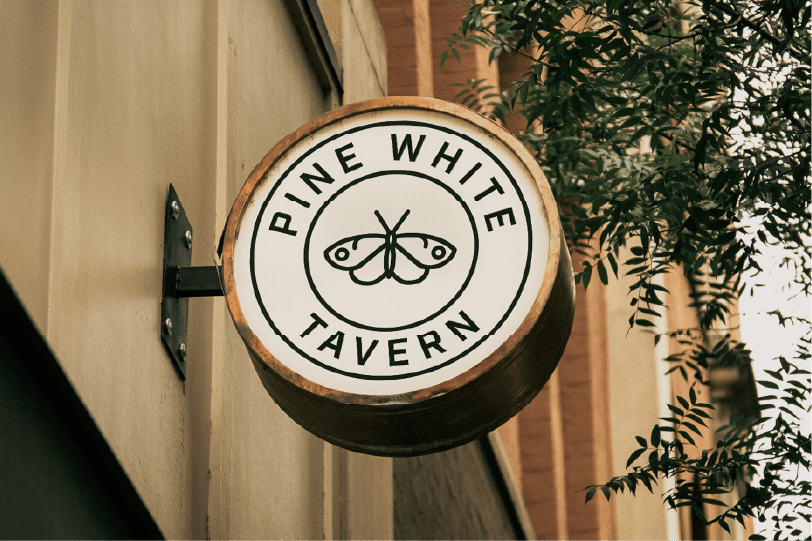
We set out to create a timeless design that could appeal to everyone, while staying true to their Oregon roots. We hand illustrated a pine white butterfly and paired it with an all caps logo for a grounded feel. Inspired by the deep greens of the Pacific Northwest, we created a color palette that evoked the organic warmth of their surroundings. To bring it all together, we used raw and natural materials such as Kraft paper and wood to create a cozy and welcoming feeling. This project also involved an onsite visit that not only helped us gain inspiration from their location, but allowed us to pull their new branding into interiors, signage, and other physical elements.